


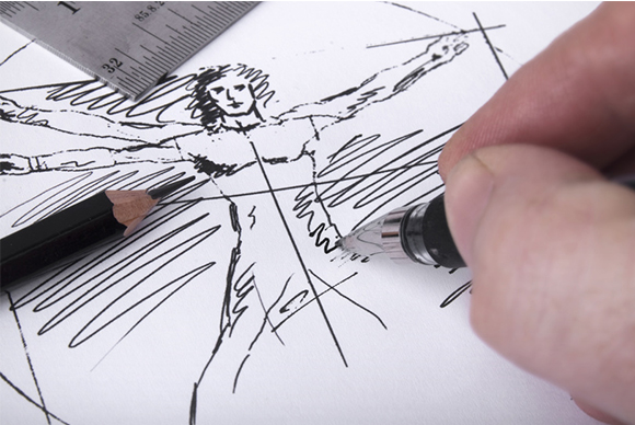
Imagine hosting a job interview for a prospective employee who arrives in a sleeveless T-shirt and cut-off jean shorts. As you can imagine, it would be pretty difficult to look passed his overall appearance to judge him on his merit and understanding of the job position alone. The logo you choose for your company and product is really no different. On a retail shelf, they say you have about 4 seconds to create your own “first impression” to the passing shopper and in that 4 seconds, you need to evoke enough interest for them to stop and pick up the product to learn more. selling the idea of your product is only half the battle; you also need to sell the idea of you as a company because lets face it, most shoppers will err on the side of a brand that looks clean and polished over one that looks slapshot or unprofessional.
Leonardo da Vinci once stated: “Simplicity is the ultimate sophistication.” and I don’t know that truer words have ever been spoken! There is a common misconception in the design world that simple designs are the easiest stage to reach. In fact, its quite the opposite, nearly all design concepts begin cluttered and overly complex; and only though several waves of refinement does a concept become simple, elegant, and most effective. This understanding is especially important when it comes to logo design because in that short 4-second moment, you need to need to convey a sense of professionalism that immediately instills confidence to your viewer.


Our own logo serves as an excellent example of this. I knew that I wanted something with a high contrast color pallet and a theme that related to gears; but beyond that; I really had no idea what it should look like. As with so many of my own customers, I was largely indifferent until I saw the first wave of design concepts and immediately spotted design characteristics that I liked, and some that I didn’t. With that information, it became possible to redirect the design effort toward something with a bit more balance and grace. In truth, I am pretty sure I doubled back on my own direction a few times but after 3 waves of refinement, we finally nailed the logo as you see it today. It’s simple, modernistic, and easily identifiable; which mets all of the expectations I had for it.
Don’t underestimate the importance of a clean and professional logo design for your own product; its so easy these days to connect with quality logo design groups that there is really no excuse for putting it off. If I recall correctly I bought the $299.00 logo design bundle (with infinite revisions) from LogoWorks for my own site and couldn’t be happier.
